The Role of Color Psychology in Print Marketing

Color choices in print marketing affect how people feel about your brand and products. The right colors can make customers more likely to buy, while poor color choices might turn them away. Understanding color psychology helps you create print materials that connect with your audience.
Research shows that up to 85% of customers say color is a main reason they buy certain products. Let's look at how different colors affect customer behavior and how to use them in your print marketing.

Basic Color Psychology in Marketing
| Color | Effect on Customers |
|---|---|
| Blue | Trust, stability, calmness |
| Red | Energy, urgency, passion |
| Green | Growth, health, nature |
| Yellow | Optimism, youth, clarity |
Color Combinations That Work
- Blue + Orange: Trust with energy
- Green + Purple: Growth with luxury
- Red + White: Impact with clarity
- Yellow + Black: Attention with power
Industry-Specific Color Usage
| Industry | Effective Colors |
|---|---|
| Healthcare | Blue, green, white |
| Food | Red, yellow, orange |
| Finance | Blue, green, gray |
| Technology | Blue, black, silver |
Print-Specific Color Considerations
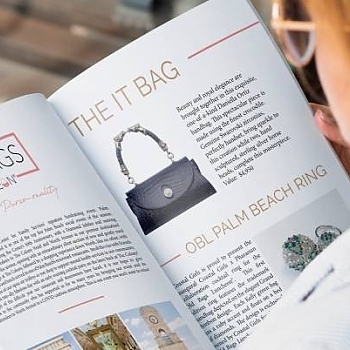
- Paper type affects color appearance - Different paper stocks absorb ink differently, affecting how vibrant colors appear in print. Glossy paper makes colors more intense, while matte paper creates softer tones. Professional printing services can help select the right paper-color combination for optimal results.
- Lighting changes how colors look - Print materials viewed under natural light versus artificial lighting can appear drastically different. Consider where your marketing materials will be displayed. Indoor office lighting requires different color choices than outdoor displays or retail environments.
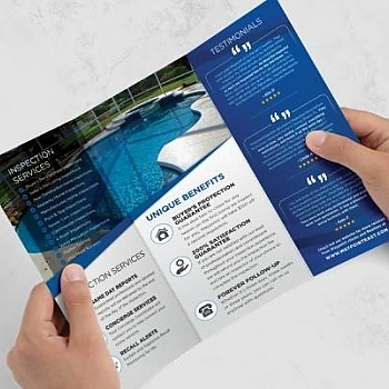
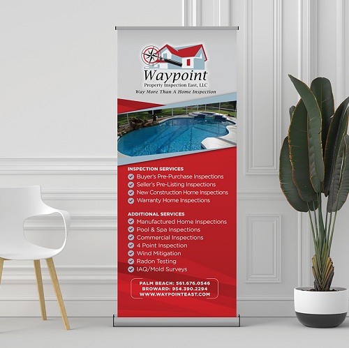
- Color consistency across materials - Maintaining brand color consistency across business cards, brochures, and banners requires precise color matching. Professional print services use color management systems to ensure your brand colors remain identical across all marketing materials.
- Cost of different color options - Full-color printing versus spot colors impacts your marketing budget. While full-color printing offers more options, strategic use of spot colors can be both cost-effective and visually striking for certain designs.
Common Color Mistakes to Avoid
- Too many colors in one design - Effective print marketing typically uses 2-3 main colors. Using too many colors can confuse viewers and weaken your brand message. Stick to your core brand colors plus one accent color for optimal visual impact.
- Poor contrast affecting readability - Text must stand out against its background for effective communication. Dark text on light backgrounds or vice versa ensures your message is clear and easy to read. Avoid similar colors for text and background in print materials.
- Colors that don't match your brand - Consistent brand colors build recognition and trust. Using random colors in print materials confuses customers and dilutes brand identity. Always reference your brand style guide when designing print marketing materials.
- Ignoring cultural color meanings - Colors carry different meanings across cultures. Research your target market's cultural associations with colors to avoid sending unintended messages. This is especially important for international or diverse market campaigns.
The right colors make your print marketing more effective. Let Leader in Print help you choose and use colors that work for your brand and message.
Ready to create eye-catching print materials with the perfect color scheme? Contact Leader in Print at 561-200-9412 to discuss your South Florida printing project today.


