How to Design Business Cards that Make a Lasting Impression
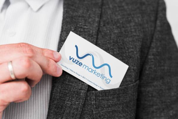
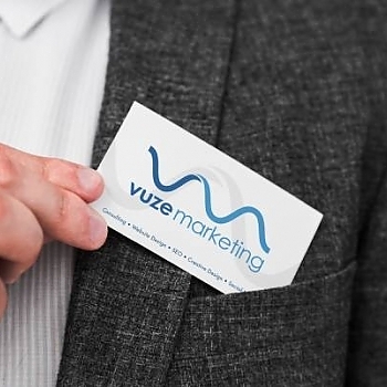
Making a strong first impression is crucial. Your business card is often the first tangible representation of your brand that potential clients or partners encounter. A well-designed business card not only conveys important contact information but also reflects your company's personality and professionalism.
Investing in high-quality, visually appealing business card design in Fort Lauderdale can help you stand out from the competition and create a lasting impression on those you meet. A memorable business card can lead to increased brand recognition, more networking opportunities, and ultimately, business growth.
In this guide, we'll explore the key elements of effective business card design and provide tips for creating cards that truly represent your brand and leave a positive, lasting impact on your target audience.
Choosing the Right Color Scheme
Color plays a significant role in business card design, as it can evoke emotions, convey brand personality, and create visual interest. When selecting a color scheme for your business cards, consider your brand's existing color palette and the message you want to communicate.
For a professional and classic look, opt for a minimalist color scheme using black, white, or grayscale. This timeless approach allows your contact information to take center stage and ensures readability. If you want to showcase your brand's personality or add a pop of color, consider incorporating one or two accent colors that complement your logo or industry.
When using color, be mindful of color psychology and the associations people make with different hues. For example, blue often represents trust and stability, while green can signify growth and environmental consciousness. Choose colors that align with your brand values and resonate with your target audience.
| Color | Associations |
|---|---|
| Blue | Trust, stability, professionalism |
| Green | Growth, environmental consciousness, harmony |
| Red | Passion, energy, excitement |
| Purple | Creativity, luxury, spirituality |
Typography and Readability
The typography you choose for your business card can greatly impact its readability and overall aesthetic. When selecting fonts, prioritize legibility and opt for clean, professional typefaces that align with your brand identity.
Consider using a maximum of two font families on your business card to maintain a cohesive look. Use a larger, bold font for your name and a smaller, easy-to-read font for your contact information. Avoid using overly decorative or hard-to-read scripts, as they can hinder the clarity of your message.
When arranging your text, ensure there is sufficient contrast between the font color and background to enhance readability. Use whitespace effectively to give your content room to breathe and create a balanced, visually appealing layout.
- Choose legible, professional fonts
- Limit the number of font families used
- Ensure sufficient contrast for readability
- Utilize whitespace for a balanced layout
Crafting a Memorable Logo and Brand Identity
Your business card is an excellent opportunity to showcase your brand identity and make a lasting impression. Incorporating a well-designed logo on your card can help establish brand recognition and create a professional image.
If you don't have a logo, consider working with a graphic designer to create one that represents your brand effectively. Your logo should be simple, memorable, and easily recognizable at various sizes. Once you have a logo, ensure it is prominently displayed on your business card, typically at the top or center of the design.
In addition to your logo, consider including other brand elements such as your tagline, brand colors, or a unique design feature that sets your card apart. Consistency is key when it comes to branding, so make sure your business card design aligns with your overall brand identity across all of your marketing materials.
Selecting the Right Paper Stock and Finishing Touches
The paper stock you choose for your business cards can significantly impact their perceived quality and durability. Opt for a thicker, high-quality paper stock that feels substantial and conveys professionalism. Common paper weights for business cards range from 14pt to 16pt, with 16pt being the thickest and most premium option.
In addition to paper thickness, consider the finish of your business cards. A matte finish provides a smooth, non-glossy surface that can give your cards a sophisticated look. Glossy finishes, on the other hand, can make colors appear more vibrant and add a shine to your design. Specialty finishes like spot UV, foil stamping, or embossing can add visual interest and texture to your cards, making them even more memorable.
When selecting finishing touches, keep in mind the overall aesthetic you want to achieve and the impression you want to make on your recipients. Premium finishes can elevate your business card design, but they may also increase production costs, so consider your budget when making these decisions.
| Paper Weight | Thickness |
|---|---|
| 14pt | Standard thickness, economical |
| 16pt | Thicker, more substantial feel |
| Finish | Effect |
| Matte | Non-glossy, smooth, sophisticated |
| Glossy | Shiny, vibrant colors |
| Spot UV | Selective glossy highlights |
| Foil Stamping | Metallic accents, premium look |
| Embossing | Raised or recessed design elements |
Optimizing Your Business Card for Networking Success
A well-designed business card is a powerful networking tool that can help you make valuable connections and grow your business. To maximize the impact of your business cards, consider the following tips:
- Always carry business cards with you, as you never know when a networking opportunity may arise
- When exchanging cards, take a moment to personalize the interaction by writing a brief note or highlighting a key point from your conversation
- Follow up with new contacts promptly, referencing your business card and the context in which you met
- Use your business card as a call-to-action, encouraging recipients to visit your website, schedule a consultation, or join your mailing list
By treating your business card as an extension of your professional brand and using it strategically in networking situations, you can create lasting impressions and build meaningful relationships that contribute to your business success.
Remember, your business card is often the first point of contact between you and potential clients or partners. By investing in professional business card printing services, you demonstrate your commitment to professionalism and attention to detail, setting the stage for successful business interactions.
Designing a business card that makes a lasting impression requires careful consideration of color, typography, branding, paper stock, and finishing touches. By following the tips and best practices outlined in this guide, you can create a business card that effectively represents your brand, communicates your contact information, and leaves a positive, memorable impact on those you meet.
Remember to prioritize readability, consistency with your brand identity, and the overall aesthetic appeal of your design. Don't be afraid to experiment with creative elements or premium finishes that align with your brand personality and target audience.
Ultimately, a well-designed business card is a valuable investment in your professional success. By putting your best foot forward with a high-quality, memorable business card, you can open doors to new opportunities, build stronger connections, and establish a positive reputation in your industry.
Take your business card game to the next level with LeaderInPrint, the premier printing service in Fort Lauderdale. Contact us or call 561-200-9412 to discuss your project and unlock the full potential of high-quality business card printing.


