Direct Mail Design: From Concept to Doorstep We’ve Got You Covered

When it comes to marketing your business, it's important to try different avenues both online and in-person to reach your target audience. For example, did you know that 70 percent of consumers say direct mail is more personal than online interactions?
From flyers to personal invitations, direct mail can be a successful part of your business. However, in order to stand out, you need to have an eye-catching direct mail design.
Continue reading to learn how you can set up your direct mail campaigns to fit your brand and see big results.
What is Direct Mail?
Direct mail marketing is when your assets, such as a postcard or flyer, are delivered physically to a prospect’s mailbox in the hopes of getting them to patronize your business.
Nowadays, most companies use online marketing for the majority of their marketing strategies. However, the direct mail printing business continues to thrive when it comes to getting your company in front of new potential customers. In fact, in many ways, direct mail solutions can be more interactive and engaging than online ads.
Building a Concept
There are many things to think about before your direct mail ends up on someone's doorstep. You want to be sure your mail gets noticed!
Choose the Right Format
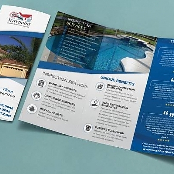
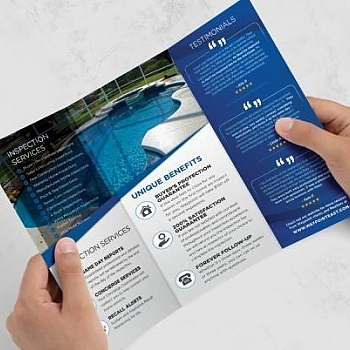
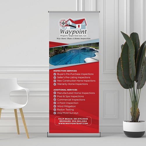
In direct mail printing, there is a multitude of options. You can choose between brochures, business cards, postcards, catalogs, flyers, banners, and much more.
Each format communicates something different to the consumer so you want to be sure you have the right format for your business. For example, brochures can give lots of information about your company while a business card is very direct and to the point.
Pick the Right Colors and Layout
You want something eye-catching that your prospect won't want to throw away. This all comes from using the right colors and being sure your direct mail design is full of information, but not overly messy and crowded.
Use a grid layout to determine where you want to position your logo, imagery, and copy. Be sure to also utilize white space to give your eyes rest in between all of your information. Stay on-brand with your colors and images for consistency, but also feel free to experiment a bit!
Messaging and CTA
Once you have your prospect's attention, you want to be sure you give them the right information and a call-to-action (CTA). Start with your original goal for sending the mailer. Do you want them to contact you, visit your website, or use a coupon?
Keep the messaging concise and digestible. Be sure to make the call-to-action noticeable and informative.
Proof and Send
Once you've built your design, be sure to proof it. Proofing happens right before the design goes to the printer. Have other members of your team take a look as well to be sure there are no errors in design, messaging, or in your CTA.
Once you're happy with your proof, it's time to send it off! Consider running an A/B test with two different headlines or imagery to see which works best for your company.
Direct Mail Design
Starting a new direct mail marketing campaign can be tricky. There are many factors you'll want to get right before sending to your prospect's doorstep. With these tips in mind, remember to be eye-catching, concise, and have a clear call to action for the consumer.
For more information on how you can begin building your direct mail design, contact us today!


Comments